




This blog is specially created for my Computer Graphic Subject's Assignments.. A ride to the graphics world..:D
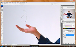 Ok. This is the 1st step of the tutorial. 1st i zoomed to the hand part of the man. And we are suposed to put flames over his hand. So, at 1st, I selected the lasso tool, and I draw a simple fire shape.
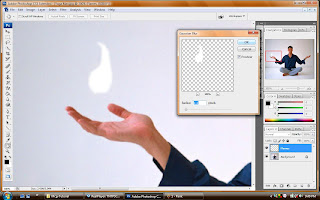 After that, I click the D button to select the default color. And I clicked alt+backspace to give white color inside the fire. And I added Gaussian blur effect to make the flame look soft at the edges.
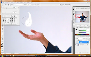 And then, I selected the brush tool and reduced the hardness to zero. And adjusted the diameter to a proper size.
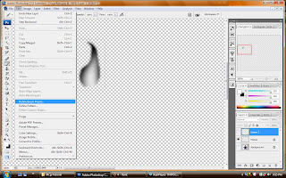 I darken the area around the flame using the brush tool. And then, I turned off the visibility of the background. I selected the flame and clicked define brush preset under the edit bar. And I named it flame. So it is already a new brush pattern now.
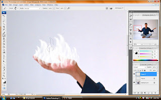 I turned on the visibility and i created a new layer. And I selected the new brush from the brush palette. I clicked X to invert the default color. I added the brush effect of the flame with random size.
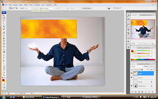 On this step, I created a box and added 2 colors which is red and yellow. And added the clouds effect.
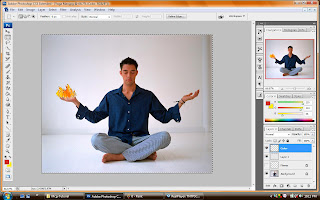 I brought the colored box to the flame and set to an appropriate shape. And selected the layers outside the flame and delete it. Now, the flame has its color.
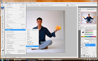 I added the liquify effect to the flames to make it look real. And I copied the flames to another hand and flipped it horizontal.
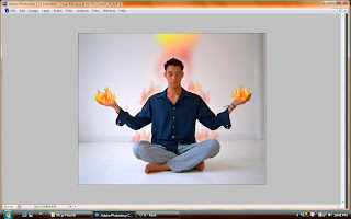 This is the final effect. I added some fire shape above his head and reduced the opacity. I also added some fire shape using the same techniques above his shoulders and knees. And reduced the opacity to give a warming effect. The end of tutorial 5.:)
 Ok. This is the beginning step of my assignment 2. I used the lens flare effect to create my background. A simple one.I adjusted the lens type to a proper setting and adjusted the brightness to 115. It looked just nice.
 Now, we can see the focused lighting effect coming from the bright point. That focused lighting effect I created by using the lasso tool. I created a long cone shape and filled it white color, and reduced the opacity. I added a round shape on top and reduced the opacity but brighter than the cone shape because I want to put wordings there. And I added the Gaussian blur effect to the shapes to make it look real.
 Then, I added the text. I created the FOM letter in capital. And I added the gradient color for temporary which is red white and blue. And I added few blending effects which is drop shadow and inner shadow.
 I added two round shapes behind both of the wordings and reduced the opacity.
 Here I added the MMU logo on top of my wallpaper and distort the image. I duplicated few layers till the end while reducing each of their opacity.
 And then, I added three images of FOM building structures. But before that, we can see that my wordings and the shapes now look better. I changed the color and added Gaussian blur effect to the big round shapes and adjusted the text to look better.
 Here is our hero of the wallpaper. MMU Mascot!!:) I added his image and used the brush strokes effect to make him look better. Angle strokes is the effect I choose because it suits him well. And I adjusted the direction balance, stroke length and sharpness to a proper level. I even added some blending effects for him.
  Next, I added some effects to our images. Here I uses the brush strokes effect as well. But I added the sumi-e effect. It gives a simple nice look for the image. And I adjusted the contrast to 19. It looked simply simple.. The same effect is used for all the 3 images.
 Getting to the final touch. I adjusted the brightness and contrast to a proper level. And here it is. The digital wallpaper for FOM OPEN DAY.:)
 Work done. FOM OPEN DAY : Digital Wallpaper...
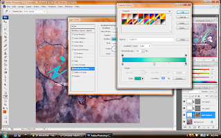 First of all, I started with the wordings layer. I went to the gradient editor and set a cool warming colour. The combination of blue and green. I added the drop shadow, inner shadow, outer glow, and satin effects on the wording.
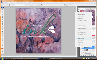 And then I copied the effects i put for the wording and applied to the drops. So that they look balanced and simple.
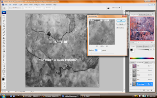 And then, as guided in the tutorial, I created the green layers copy in the channels pallete. And I added the gaussian blur effect.
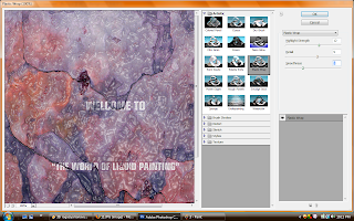 After done all that, I added the effect for the background. I used plastic wrap effect under the artistic effect tool and I adjusted Detail, Smoothness, and the highlight strength. It looks just nice for the background. I applied the effect.
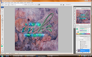

 I added a new layer in the channels panel where it shows Layer1. And then I selected the lines tool to add the lines.
 I added the white lines with different weights and this is the result after disable the view of RGB channels.
 This is where I added the filter -brush strokes - spatter. And I adjusted the spray radius and smoothness.
Project Charter Assignment 1
Project Start Date: 20thNovember 2008
Project Finish Date: 28 November, 2008.
Project Manager: Raguvararaj s/o Muthualagu
HP: 019-9301829
Email: raguvararaj@yahoo.com.sg
Project Objective: Students are to create a multi-cultural event for a post card. The theme would be
“
Approach: First of all before creating the postcard, I set the pixels to 300pixels and adjusted the size to 6 x 8. I used few images such as, Malaysian flag, our Malaysian ethnics, unity and fireworks image. There are few basic tools that I used to create my postcard. Such as, mask layer, some tools from the filter gallery, lasso, crop, text, distort, twirl, drop shadow and inner shadow. There will be some changes before I finish up my work. I updated the process of creating my postcard on my blog soon. I used full use of the internet to find some video about photoshop experts and I learnt a lot from the videos. The making process are be explained in detail in my blog.
-20th/11 – I downloaded the pictures and added on photoshop.
-22nd/11- I played with the images by adding effects and trying all
the tools to learn more.
-24th/11 – I looked through some videos to learn from it and imply
on work.
-25th/11 – Today I am going to finish my work by 85%. By tonight
or tomorrow morning, I will make it done. By tomorrow
I will consult madam
-27th/11 – I will finish my work and submit in my blog and print it
out .And the final worl I will submit the next day, which is on 28th/11.
Comment: I did learnt a lot of things during this journey of mine doing the 1st assignment. I learnt how to make a picture look real, how to put drop shadow, how to put colors on an image, how to crop an image and a lot of other things. I did had difficulties on adding effects and play with the image. The videos from the tutorial and the videos from internet improved my learning process.